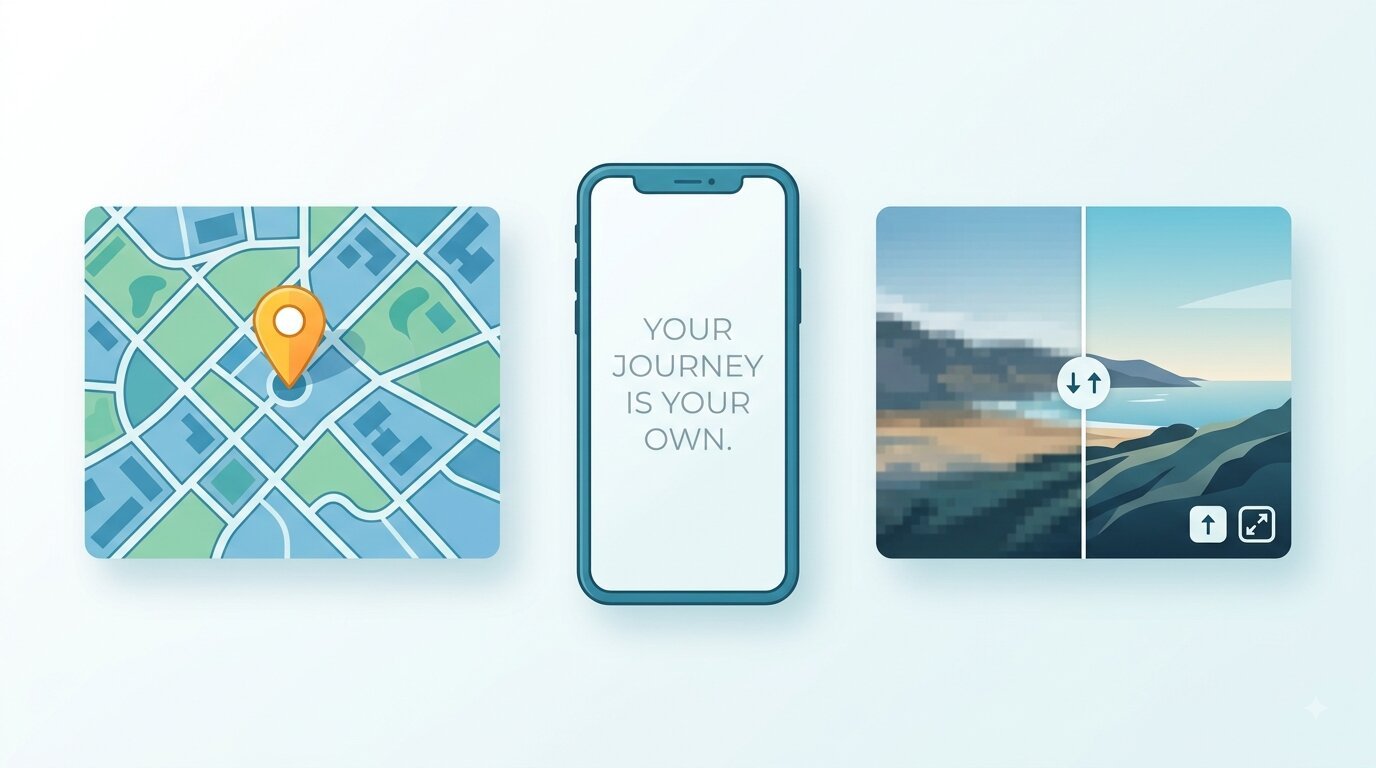
Map Marker to Text Wallpaper Maker: The Small Tools That Quietly Do a Lot
Some tools you only need once a year. Others sneak into your weekly routine without you noticing. The handful covered here — a map marker generator, a text wallpaper maker, and an image upscaler — belong to that second group. They're small, they load fast, and they solve annoyingly specific problems that bigger software makes you jump through hoops for.
If you've ever tried to drop a clean pin on a map for a blog post, turn a quote into a phone background, or rescue a blurry photo before printing it, you already know the friction. This walks through what each tool actually does well, where people trip up, and how to get a usable result on the first try instead of the fifth.
What a map marker tool is really for
A map marker is the little pin that says "here." Sounds basic, but the moment you need one that matches your brand color, sits at exact coordinates, or exports cleanly into a slide, the default Google pin stops being enough.
People reach for a dedicated map marker tool for a few recurring reasons. A teacher building a geography worksheet wants numbered markers on a static map. A small business owner needs a single custom pin on their contact page. A travel blogger wants to show a route with several stops, each labeled.
The advantage of a purpose-built marker generator is control. You pick the shape, the color, sometimes the label, and you get an image or embed you can actually reuse. No account, no sprawling dashboard.
A common mistake worth flagging: people export markers at screen resolution and then wonder why they look fuzzy in a printed handout. If the marker is going anywhere near paper or a large display, generate it larger than you think you need. Shrinking down stays crisp; blowing up never does.
When you'd pick a marker tool over full mapping software
Full GIS platforms are overkill for most everyday needs. If your task is "put three pins on a map and save it as a picture," you don't need layers, geocoding APIs, or a subscription. You need something that opens, does the one job, and closes.
Reach for the heavier software only when you're handling live data, hundreds of points, or interactive maps that update on their own. For a worksheet, a pitch deck, or a blog graphic, the lightweight route wins every time.
Turning words into a wallpaper people actually keep
Here's an odd truth about phone backgrounds: the ones people keep longest are usually text, not photos. A line that means something, a reminder, a goal for the year. That's the whole appeal of a text wallpaper maker — it lets you build a background around a message instead of an image.
The idea of using a tool to create a wallpaper with text has quietly gotten popular for a reason. Store-bought wallpapers are generic. A custom one carries your words, your font, your colors. It's personal without being complicated.
I'll say something slightly unpopular here. Most people ruin their text wallpapers by cramming in too much. A wallpaper is not a document. One short line, maybe two, with real breathing room around it, beats a paragraph every single time. If you have to squint to read your own background, the design failed.
Getting the layout right the first time
A few things separate a wallpaper that looks intentional from one that looks slapped together:
- Match the canvas to your device. A wallpaper built at desktop dimensions will get awkwardly cropped on a phone. Set the aspect ratio before you write a word.
- Leave room for the clock and icons. The top third of a phone screen is busy. Keep your text centered or lower so it isn't fighting the time display.
- Pick contrast over cleverness. Dark text on a dark background reads as "modern" in the editor and "invisible" on your lock screen. Test it.
- Use one font, maybe two. Mixing four typefaces is the fastest way to make something look amateur.
Font choice does a lot of quiet heavy lifting. A thin, wide typeface feels calm. A heavy condensed one feels urgent. The same sentence changes personality entirely depending on what you set it in, so try a couple before committing.
Text over a photo instead of a plain color
Sometimes a solid background is too plain and you want your words sitting on top of an actual image. That's a slightly different job — you're layering text on a photo and keeping both readable.
This is where a dedicated text-on-image editor earns its place. The trick that makes or breaks it is the layer between your photo and your text: a subtle dark gradient or a soft blur behind the words. Without it, busy photos swallow your text whole. With it, even a chaotic background reads cleanly.
Watch out for one thing. Text placed over the most detailed part of a photo — a face, a crowd, foliage — will always be harder to read than text over sky, water, or a plain wall. Compose around the quiet regions of the image.
Fixing a low-quality image before it embarrasses you
We've all had the moment. You need a photo for a print, a thumbnail, or a product listing, and the only copy you have is small and soft. Enlarging it in a basic editor just makes the blur bigger.
To genuinely convert an image to high resolution, you need upscaling that adds detail rather than just stretching pixels. Old-school resizing spreads the same information across more space, which is why it looks mushy. Modern upscalers reconstruct edges and textures, so the result stays sharp as it grows.
That said, be realistic about limits. Upscaling is restoration, not magic. A tiny, heavily compressed thumbnail can be improved, but it won't suddenly become a pristine studio shot. The better your starting image, the better your finished one — garbage in, slightly-less-garbage out.
A quick order of operations for image quality
- Start with the largest original you can find. Dig for the source file before you settle for a screenshot of it.
- Upscale before you edit. Enlarge first, then crop, add text, or adjust color — working on the bigger image keeps everything cleaner.
- Export in the right format. Use PNG for graphics and text overlays, JPG for photos where file size matters.
- Check at 100% zoom. A picture that looks fine shrunk down can fall apart at full size. Judge it at the size you'll actually use.
One practical note people forget: if you're upscaling an image specifically to use as a wallpaper, do the upscaling first, then bring it into your wallpaper maker. Building your design on a low-res base and enlarging afterward bakes the blur right into the text too.
How these tools fit together
On their own, each of these does one job. Chained together, they cover a surprising amount of ground.
Say you're making a motivational phone background from an old travel photo. You'd upscale the photo so it fills a modern screen without blurring, drop it into a text-on-image editor to add your quote, and you're done. Or you're building a class handout: generate your custom map markers, place them on a map graphic, and upscale the final export so it prints sharp.
The through-line is that none of these should require a tutorial. If a tool makes you read a manual to place a pin or center some text, it's asking too much for what it delivers.
Comparing the three at a glance
| Task | Best tool | Watch out for |
|---|---|---|
| Marking locations on a map | Map marker generator | Exporting too small for print |
| Words as a phone background | Text wallpaper maker | Overcrowding the text |
| Words over a photo | Text-on-image editor | Low contrast, busy backgrounds |
| Rescuing a blurry image | Image upscaler | Expecting miracles from tiny sources |
A few honest tips people learn the hard way
Save your work in the largest size the tool allows, even if you only need something small right now. You can always scale down later; you can rarely scale up well.
Keep a copy of the original before you start editing. It sounds obvious, and yet the number of people who overwrite their only good file is remarkable.
Don't chase trends in fonts and filters. A clean wallpaper made in 2020 still looks clean today. A heavily filtered one usually looks dated within months.
And test on the actual device. Editors lie a little — colors shift, crops move, contrast reads differently on a real screen than in a browser tab.
The takeaway
None of these tools will change your life. What they'll do is save you fifteen frustrating minutes every time you hit one of these specific walls — a pin that won't cooperate, a wallpaper that needs your words, a photo too small for the job.
Pick the right one for the task, start bigger than you need, and test on the real thing. That's most of the battle. If you're curious who builds these and why, the about page explains the thinking behind keeping them free and simple.